It has gone through so many pivotal moments in the past, all falling short, that it’s often felt that any search for Android’s response to the finesse that an Apple iPad (it can be any, including the Pro options) delivers when paired with a keyboard, may prove to be as elusive as any search has been, for the Big Foot. Perhaps not the Big Foot, but many have come close but fallen a couple of steps short. OnePlus’ own OnePlus Pad from 2023, was impressive, but the software needed more to find itself on an even peg with iPadOS. A year later, the OnePlus Pad 2 has been judged very close to Android tablet perfection. The fine print remains, however. Two sides to the same coin, as I’ll illustrate.

For starters, it must be noted that tablets are becoming larger. At least as an option among a wider consideration. The idea seems to be, a larger screen option would be great for movie viewing, reading and indeed, for work apps when the keyboard is deployed. It is the latter, which is increasingly becoming the go-to pitch. Take the OnePlus Pad 2 as an example – the screen size is now 12.1-inches, up from 11.61-inches of its predecessor, the OnePlus Pad. That’s well within the new-found range too. The Samsung Galaxy Tab S9 FE+ and the Galaxy Tab S9+ have even larger 12.4-inch screens.
Good time to look at some numbers, which illustrate OnePlus has gotten the pricing spot on. Well, almost. The 8GB RAM and 128GB storage spec is priced at ₹39,999 while the 12GB + 256GB option (this is the one we’d suggest you pick) costs ₹42,999. OnePlus has perhaps missed a trick by sticking to Wi-Fi only tablets, and hopes its ecosystem play nudges you to get a OnePlus phone too for sharing mobile data. On the pricing front, OnePlus is significantly undercutting Samsung’s Galaxy Tab S9 FE+ ( ₹55,999 onwards). The even more expensive Galaxy Tab S9+ doesn’t seem to be on sale, at least at the time of writing this.
Choosing the latest generation Qualcomm Snapdragon 8 Gen3 chip puts the OnePlus Pad 2 in a higher echelon than the Galaxy Tab S9 FE+ and its Exynos 1380 chip. That shows, as you multitask with apps in the background, side by side on the screen and interface transitions in general. You’re going to enjoy using apps such as Canva, Adobe Lightroom and OnePlus’ own Content Sync solution, a combination of power on tap and a large display.
The ecosystem play is becoming layered. OnePlus wants you to use their own branded phone alongside the OnePlus Pad 2, with Content Sync part of that pitch. Move data between the phone and the tablet, control the phone from the tablet screen and indeed edit photos and videos that reside in the phone’s gallery using apps on the tab.
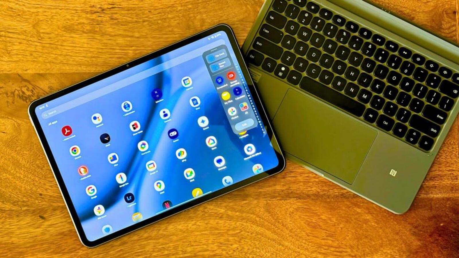
The second part to the OnePlus Pad 2 and indeed Android’s productivity pitch, is the keyboard. Given my extensive experience with the magnetic keyboard with the previous generation tablet, I’m somewhat surprised at the extent of the changes. All of which don’t seem to be a step in the right direction. The Smart Keyboard (that’d be ₹8,499 more), as it is now creatively called, is a two-part accessory. There is a magnetic back cover which can be folded out to form a kickstand, and this attaches magnetically to the tablet – good luck in getting it to align absolutely perfectly (some of us, find this really annoying).
Second is the pin-connector based keyboard, which doesn’t have any height adjustment for when you type. This can be used in Bluetooth mode too, which means you can keep the tablet a certain distance away on a table and keep this keyboard either on a table or your lap, to good effect. Battery life in the Bluetooth mode is a bit more than a couple of hours, but that’s a convenience which is good to have.
This sort of a design also means it is highly unlikely you’ll be able to use the OnePlus Pad 2 with its keyboard, on your lap or any surface that isn’t flat enough or large enough. With the magnetic keyboard design that OnePlus has surprisingly discarded this time around, the keyboard and tablet experience was taut, refined and ergonomically superior.
On the point of multitasking, OxygenOS has done more than enough to make split screen simple enough to get used to. It is not limited to two apps sharing the screen, because Open Canvas handles a third as 2+1 instead. You’ll not be doing any multi finger swipe gesture gymnastics either open or close apps open side by side. It simply works. That said, I do feel OnePlus could have done more to give OxygenOS a more productivity focused interface, one that it could switch to once the keyboard gets connected, for a potentially more familiar desktop-esque layout. That’s something which Samsung’s DeX has done to very good effect.
Software still needs work. I am unable to use the touchpad to scroll down this document in Google Docs, though that gesture works fine in Microsoft Word. At this point, I am beginning to find myself at my wits end, with who should shoulder the blame for Android tablets still having far too many rough edges, when paired with a keyboard. Should it be the tablet makers, OnePlus in this case, or perhaps even Samsung or Xiaomi? Or they’re doing their best, and the blame lies elsewhere? That’d be Google, wouldn’t it? Many promises over time to make Android tablets better for productivity usage scenarios. Results still don’t follow through on that promise.
More to that point, there’s a bit to look forward to. Software update for July brings the Recording Summary, Scan Document, AI Eraser 2.0, and AI Studio. The update in September update is expected to usher the arrival of AI Speak, AI Summary and AI Writer.
There’s a certain level of refinement that we’ve come to expect from OnePlus tablets and smartphones, and to that point, the OnePlus Pad 2 is ticking the checklist. A large battery that would last days on a single charge (even an entire day with ease, of this is your laptop replacement), and a latest generation chip, very much provide the balance of performance and battery stamina. This is a well-built tablet, and the 12.1-inch LCD display has been tuned rather well for rich enough colours – though black levels can struggle at times, but that’s a limitation of the display tech, to keep costs in check.
To be fair, there is enough argument against the new keyboard design, but we get the point of added versatility as a result. OnePlus could have done more to design a more keyboard driven productivity-oriented interface. But all things considered, the OnePlus Pad 2 more or less simply works. Judged very close to Android tablet perfection?


